My minimalist mobile phone
In an 1880 lecture, William Morris advised: “Have nothing in your houses that you do not know to be useful or believe to be beautiful”. It’s a philosophy I follow in both my physical and digital environments.
I didn’t buy a mobile phone until 2018. I’d been happy with my digital camera, which let me take photos and check the time. What changed was that I started making regular train journeys. The unreliability of the British rail network meant it would be helpful to be able to look up live train times while travelling.
My phone soon replaced the digital clock on my bedside table, my CD collection, my paper maps, and even my digital camera. I’d resisted buying a phone out of a desire for fewer material possessions, but in the end it was owning a phone that let me achieve this.
Many people have fallen into a trap of replacing physical clutter with digital clutter, with notifications from dozens of apps constantly fighting for their attention. This page explains my minimalist mobile phone set-up, which ensures my phone remains a positive presence in my life.
My lock screen
A black lock screen background may seem boring and impersonal, but it has a practical purpose: it means I can check the time during the night without lighting up the room. I also like how it combines with the dark blue body to give the phone a slab-like appearance.
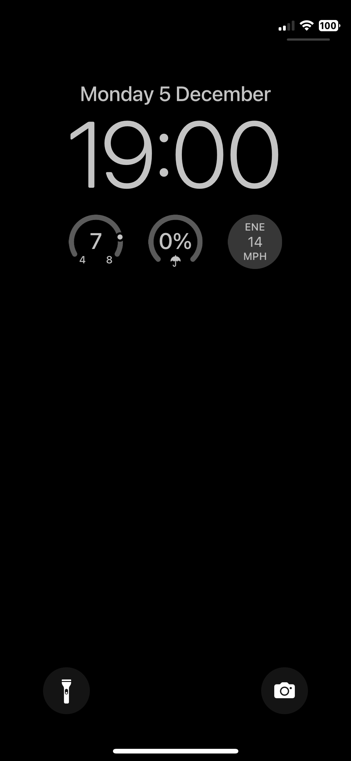
I’ve made two customisations to the lock screen. Firstly, the battery icon shows the percentage remaining, so that I can more easily judge whether it needs charging. Secondly, widgets show the current temperature, chance of rain, and wind speed, so I can quickly check whether I’ll need to wear a coat. Tapping on any of these widgets opens the Weather app for more detail.
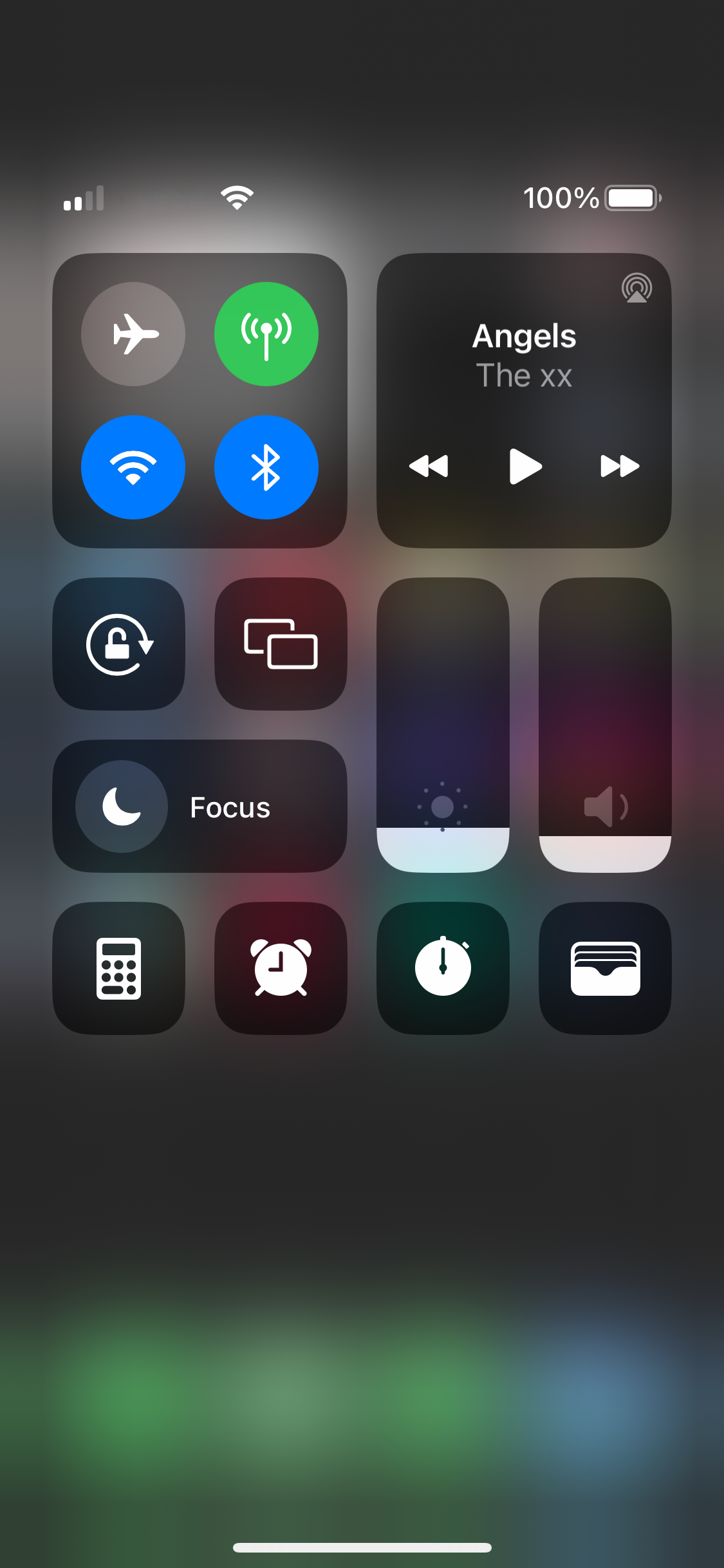
My control centre
I’ve enabled four controls in the control centre: Calculator, Alarm, Stopwatch, and Wallet. I use these apps infrequently (I only set an alarm if I need to wake up unusually early), and adding them to the control centre keeps them out of the way but still easily accessible when I need them.
My home screen
My home screen also has a black background, as I feel anything else clashes with the multicoloured app icons. I only have a single page of apps, and even that page has an empty row. Every app I regularly use is accessible either through this screen or by swiping to the lock screen or control centre.
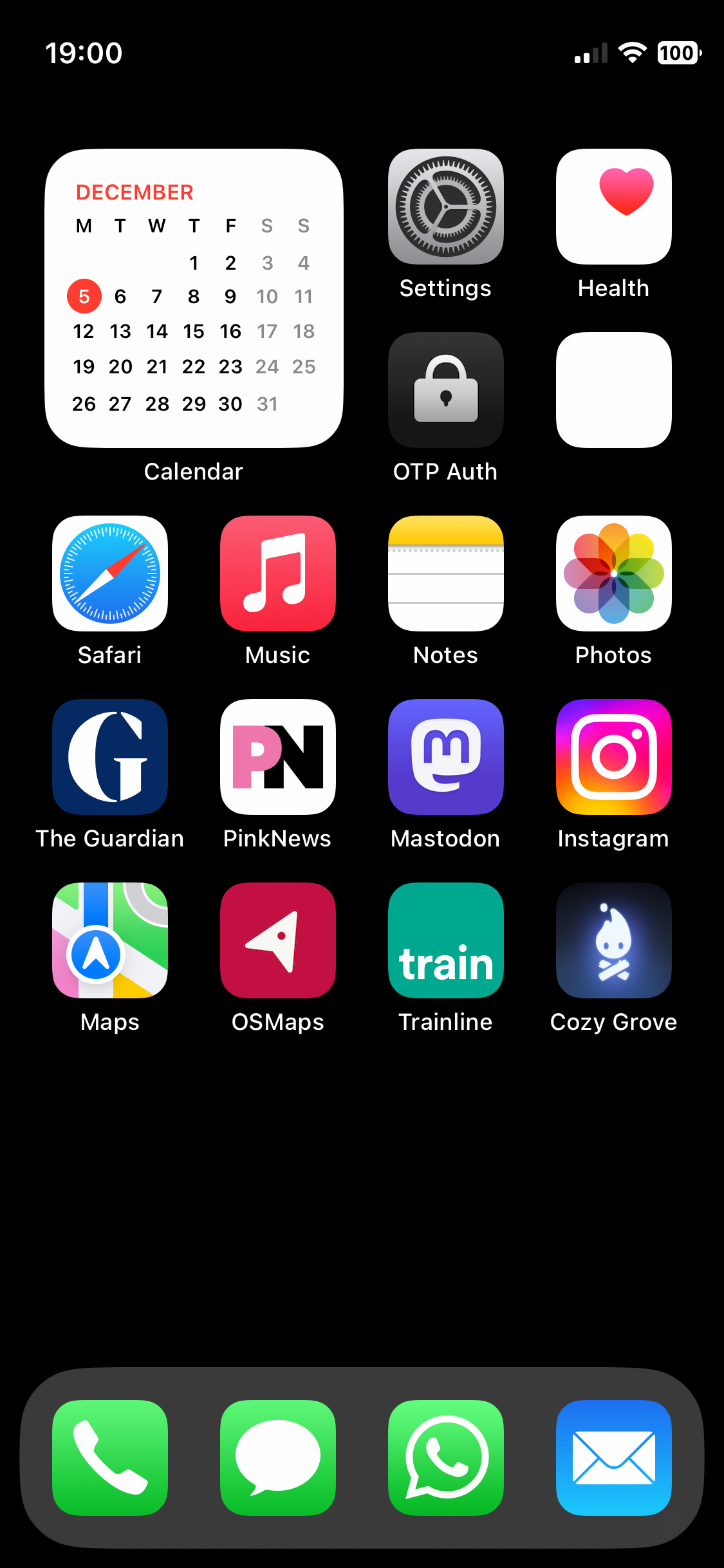
In the dock are the standard contact apps — Phone, Messages, and Mail — along with WhatsApp (as I’ve been unable to persuade anyone I know to use Signal). Phone, Messages, and WhatsApp are the only apps for which I’ve enabled notifications, as these are used for real-time communication. E-mails are less urgent, so I’ve enabled the badge to show if there are unread e-mails, but I haven’t enabled notifications.
In the top-left corner is the Calendar widget. Showing the widget rather than the app icon lets me quickly visualise the month and see how far away a given date is without needing to open the app. Tapping the widget opens the app when I do need it.
The apps are organised into roughly thematic groups. The first row contains apps with details of my phone (Settings) and body (Health). The second row contains apps allowing me to securely log in to other platforms (OTP Auth) and my bank (the app that I’ve anonymised in the screenshot).
The next two rows contain apps relating to consuming and producing content. The upper row contains Apple apps for reading (Safari), listening (Music), writing (Notes), and browsing photos (Photos), while the lower row contains third-party apps.
For news I use The Guardian and PinkNews. The Guardian is the most progressive of the mainstream British news organisations, but has a poor record on queer issues due a transphobic editorial line (in common with most of the British media), so I get my queer news from PinkNews.
For social media I use Mastodon and Instagram. Mastodon is where I’m most active (posting a few times a week), while Instagram is where I keep up with friends and browse landscape photography. Neither app has notifications or badges enabled, as I’m happy to wait until the next time I open them to see whether anyone has interacted with me.
The final row begins with apps relating to travel. Apple’s Maps is good for navigating in urban areas, while the Ordnance Survey’s OSMaps gives much more detail in rural areas. The Trainline lets me plan changes to train journeys while travelling. Finally, I always have a relaxing, slow-paced game installed (at the time of writing, it’s Cozy Grove).
The missing app icons
The Camera, Weather, Calculator, Clock, and Wallet apps are all accessible by swiping to the lock screen or control centre. The functionality of the Contacts and FaceTime apps can be accessed through the Phone app, so I don’t see the need for their dedicated apps. Any other app that’s not on the home screen is still accessible by swiping to the App Library, but I rarely need to do this.