A bad graph at the Design Museum
When visiting London we’ll often spend a design-themed morning in Kensington, starting with a walk through Hyde Park and Kensington Gardens, followed by breakfast at Dishoom and visits to Japan House, the Design Museum, and Holland Park.
In contrast to the perpetually busy museums of Exhibition Road (the Natural History Museum, Science Museum, and Victoria & Albert Museum), the Design Museum is a quieter, calmer space, with galleries organised around a triple-height atrium under a hyperbolic paraboloid roof.
At the time of writing, a temporary exhibition titled How to Build a Low-Carbon Home occupies the first-floor mezzanine. This exhibition focuses on the use of wood, stone, and straw as low-carbon building materials, and alongside samples of these materials and products derived from them is this graph:
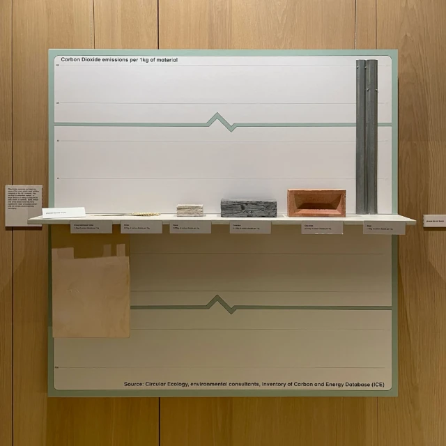
In the context of the surrounding displays, it isn’t immediately apparent that this is a graph and not just another set of material samples. The first indication otherwise is the presence of two please do not touch signs (one on the shelf and one on the wall to the right), as visitors are encouraged to touch the samples elsewhere in the exhibition. Realising this is a graph is only the first challenge though, as it features a number of confusing design choices that make it harder to interpret and reduce its impact.
The broken y-axis
The two thick horizontal lines with zigzags look like the data series on a line graph, but in this case they are being used to indicate the broken y-axis. This is an unconventional choice when a broken axis is usually indicated by a zigzag on the axis itself, which is oriented at a right angle to the lines on this graph.
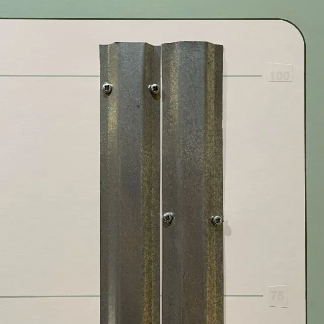
A broken y-axis makes a bar graph harder to interpret as the heights of the bars no longer correspond to the values they represent, requiring the reader to consult the axis labels. However, the y-axis on the right of the graph had been incorrectly labelled, which would have been particularly problematic as these labels were immediately next to the bar affected by the broken axis. This mistake had been spotted before our visit and white stickers had been placed over the incorrect labels, although they could still be seen through the stickers:
The tragedy is that the broken y-axis isn’t even necessary. The overall scale of the graph seems to have been determined by the desire to use a single standard brick to represent the carbon emissions of clay bricks, but even with this constraint there would have been plenty of room on the wall for a graph with an unbroken y-axis, which would only have been half as tall again.
The material samples
Visitors may notice that there are labels for six materials, but only five material samples on the shelf, with the piece of straw lying across the labels for both cross-laminated timber and straw itself. This is because cross-laminated timber is assessed to be carbon-negative, so is represented by wide piece of timber attached to the bottom of the shelf. This is easily overlooked, particularly for visitors standing close to the graph who might not notice it lurking in the shadow below the shelf.
The material samples have different widths, which is unintentionally misleading. Only the heights of the samples matter, but we instinctively notice their overall size. The block of stone is about two-thirds the height of the block of concrete, but the difference is exaggerated because the much wider block of concrete is about four times larger overall.
Graphing the wrong thing
Beyond the confusing design choices, this graph has a more fundamental problem. It shows the carbon emissions for each kilogram of material, but this isn’t the most relevant metric to use when comparing building materials. Different materials require different construction techniques, so a concrete building will weigh much more than a similarly-sized wooden building. It would be more appropriate to compare the total carbon emissions produced in the construction and occupation of equivalent buildings.