My minimalist mobile phone
In an 1880 lecture, William Morris advised: “Have nothing in your houses that you do not know to be useful or believe to be beautiful”. It’s a philosophy I follow in both my physical and digital environments.
I didn’t buy a mobile phone until 2018. I’d been happy with my digital camera, which let me take photos and check the time. What changed was that I started making regular train journeys. The unreliability of the British rail network meant it would be helpful to be able to look up live train times while travelling.
My phone soon replaced the digital clock on my bedside table, my CD collection, my paper maps, and even my digital camera. I’d resisted buying a phone out of a desire for fewer material possessions, but in the end it was owning a phone that let me achieve this.
Many people have fallen into a trap of replacing physical clutter with digital clutter, with notifications from dozens of apps constantly fighting for their attention. This page explains my minimalist mobile phone set-up, which ensures my phone remains a positive presence in my life.
My lock screen
A black lock screen background may seem boring and impersonal, but it has a practical purpose: it means I can check the time during the night without lighting up the room. I also like how it combines with the dark blue body to give the phone a slab-like appearance.
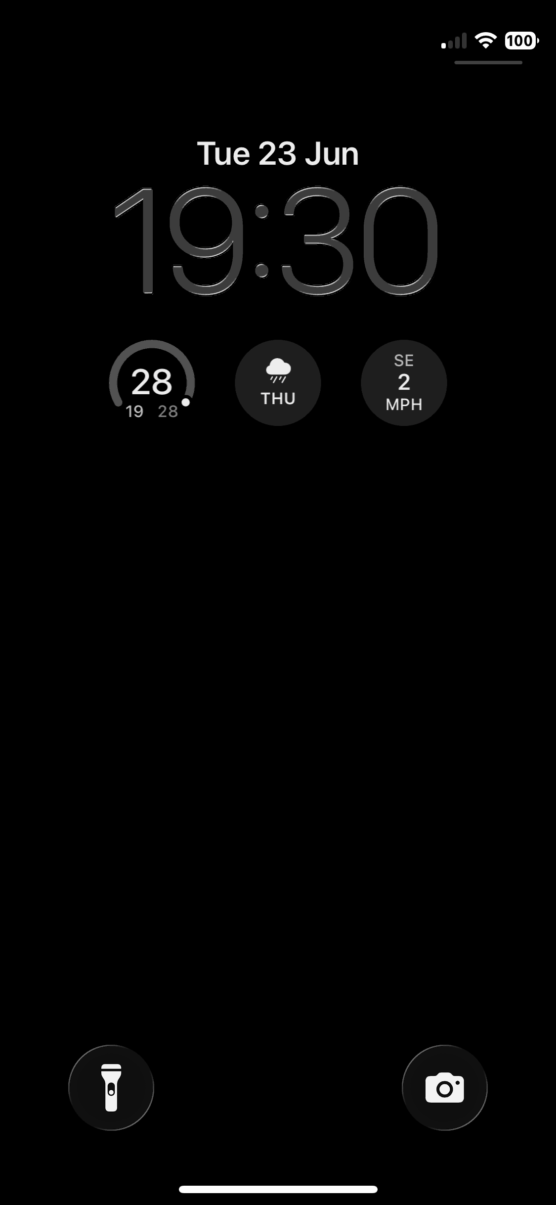
I’ve made two customisations to the lock screen. Firstly, the battery icon shows the percentage remaining, so that I can more easily judge whether it needs charging. Secondly, widgets show the current temperature, chance of rain, and wind speed, so I can quickly check whether I’ll need a coat. Tapping on any of these widgets opens the Weather app for more detail.
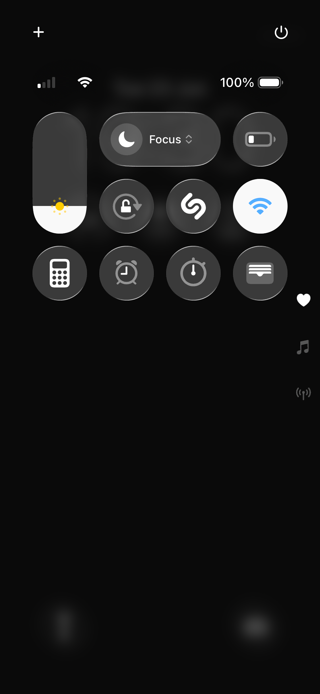
My control centre
I use the control centre for settings I want to be easily accessible, and small apps I only use infrequently: Brightness, Focus (‘do not disturb’), Low Power Mode, Orientation Lock, Recognise Music, WiFi (positioned so that its default highlighted state balances the brightness slider on the other side of the screen), Calculator, Alarm, Stopwatch, and Wallet.
My home screen
My home screen also has a black background, as I feel anything else clashes with the multicoloured app icons. I only have a single page of apps. Every app I regularly use is accessible either through this screen or by swiping to the lock screen or control centre.
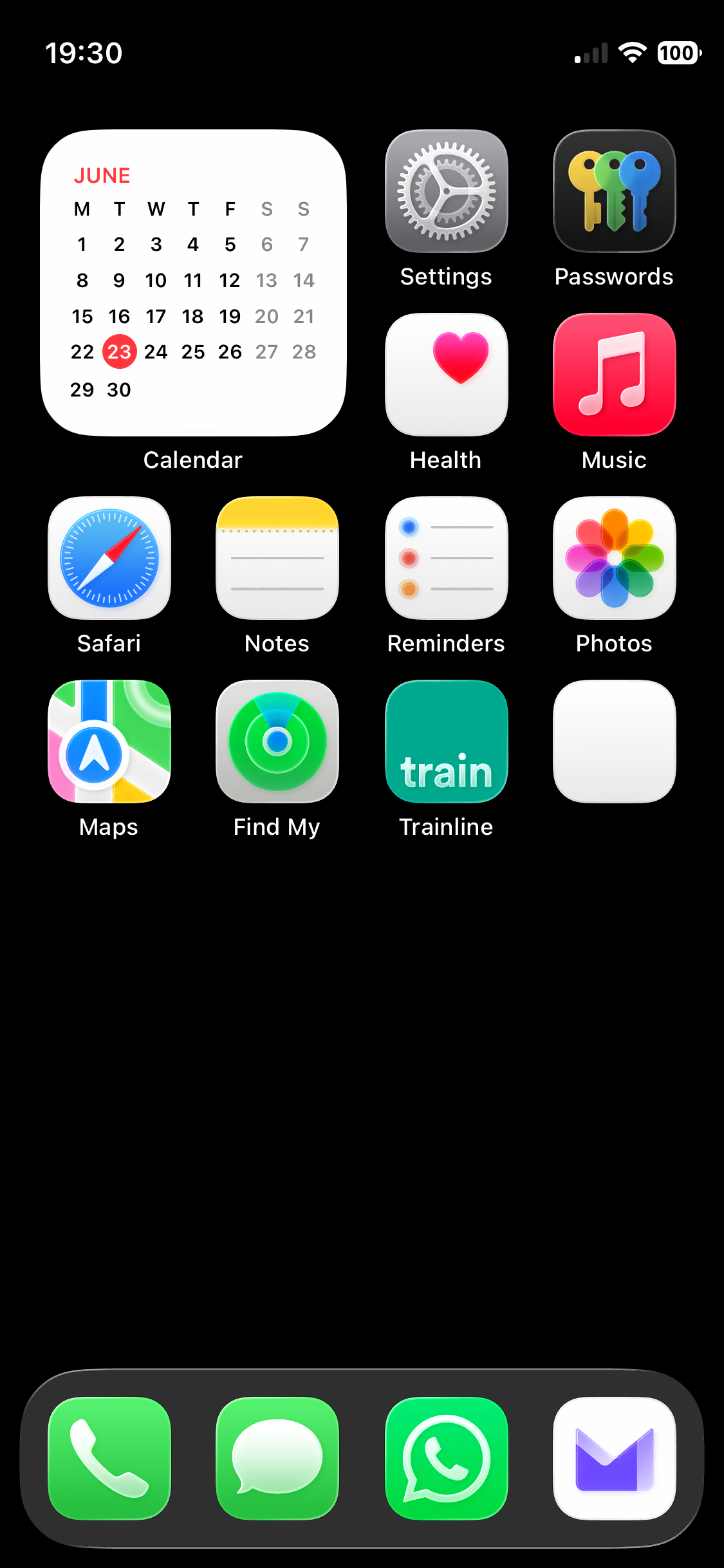
The apps are arranged partly thematically (with apps for communication and travel grouped together) and party to balance the appearance of the screen, in terms of both colour and icon design.
The dock contains apps for communication: Phone, Messages, WhatsApp (as I’ve been unable to persuade anyone I know to use Signal), and Proton Mail. Phone, Messages, and WhatsApp are the only apps for which I’ve enabled notifications, as they’re used for real-time communication. E-mails are less urgent, so I’ve enabled the badge to show if there are unread e-mails, but I haven’t enabled notifications.
In the top-left corner is the Calendar widget. Showing the widget rather than the app icon lets me quickly visualise the month and see how far away a given date is without needing to open the app. Tapping the widget opens the app when I do need it.
Next to the Calendar widget are Settings (for accessing any settings not shown in the control centre), Passwords (for accessing one-time codes for two-factor authentication), Health, and Music. The white and red of Health and Music balance the Calendar widget.
The next row contains Safari, Notes, Reminders, and Photos. All of these icons have a white background, with the rounded symbols on the Safari and Photos icons and the lines on the Notes and Reminders icons producing an approximate symmetry.
The final row contains Maps, Find My (which I use to time the preparation and serving of meals for my wife’s arrival home), Trainline (for viewing train times and booking tickets), and my bank (which I’ve anonymised in the screenshot).
The missing default app icons
The Camera, Weather, Calculator, Clock, and Wallet apps are all accessible by swiping to the lock screen or control centre. The functionality of the Contacts and FaceTime apps can be accessed through the Phone app, so I don’t see the need for their dedicated apps.